A merchant came to us last quarter spending $6,000 a month on ads and converting at 0.9%. His first question was the usual one: which channel should he cut? We opened his store on a mid-range Android and had the answer in four minutes. The buy button needed a scroll to reach. The size guide was a PDF at the foot of the page. The cart refused to show shipping cost until the payment step. His problem was not traffic.
That story repeats because most "ecommerce website features" lists are written for people choosing a platform, not for store owners hunting for what is missing. This one is for the second group. When we audit stores against it, the average score is 11 out of 31. Every item says what the feature is, why it matters in one line, and how to check if your store has it. Grab a phone, not a spreadsheet.
Foundation Ecommerce Website Features: Speed, Mobile, SSL, Uptime
Everything else sits on this layer, so we check it first. Speed is the silent killer: Google has confirmed Core Web Vitals feed rankings, but the conversion math is worse. Google's published finding: as mobile load time goes from one to three seconds, bounce probability rises 32 percent. Shopify includes SSL and uptime; on self-hosted stacks like WooCommerce, they are your job.
- Sub-3-second Largest Contentful Paint on mobile. What: the time your main content renders on a real phone. Why: every extra second shaves a measurable slice off conversion. How to check: run PageSpeed Insights and read the field data section, not just the lab score.
- A mobile layout that passes the thumb test. What: reachable buy button, readable type, no hover-only interactions. Why: most ecommerce traffic is mobile, and it already converts lower; layout friction widens the gap. How to check: browse your store on an actual phone. We test on a cheap Android over hotel wifi, because that is closer to your customer's reality than an office iPhone.
- HTTPS on every page. What: a valid SSL certificate covering the whole store, not just checkout. Why: browsers flag non-HTTPS pages as "not secure," which kills trust at the exact moment it matters. How to check: look for the padlock on a product page, then crawl with Screaming Frog filtered to http:// URLs to catch stragglers.
- Uptime you actually monitor. What: the store responding 24/7, with alerts when it is not. Why: an hour of downtime during a campaign is ad spend pointed at a closed door. How to check: review your host's uptime history; put a free monitor like UptimeRobot with SMS alerts on self-hosted stores.
Catalog Ecommerce Website Features: Variants, Filters, Search, Comparison
The catalog layer decides whether a visitor who already wants to buy can find the thing.
- Product variants done properly. What: size, color, and material options as swatches or dropdowns tied to real inventory. Why: dead-end variants (pick a size, then "out of stock" at the cart) are among the most common ways product pages leak buyers. How to check: open each top seller and click every variant, confirming price, image, and stock update together.
- Filtering that actually filters. What: facet filters for size, color, price, and attributes that matter in your category. Why: Baymard's navigation research keeps flagging category filtering as one of the most under-supported elements; large catalogs bury products without it. How to check: open your biggest collection and narrow it to one realistic choice using only filters. Shopify's free Search & Discovery app builds these natively.
- Search with synonyms and zero-result tracking. What: internal search that understands synonyms and logs every query. Why: searchers convert at a multiple of browsers, and zero-result queries are free product ideas. How to check: search three customer terms, one misspelled and one a synonym; then read your search analytics monthly.
- Comparison where decisions need it. What: a side-by-side view or clear spec tables for considered purchases. Why: research-heavy purchases stall on spec questions; comparison closes them without a support ticket. How to check: if you sell electronics, furniture, or supplements, confirm two products can be compared without opening four tabs.
Product Page Ecommerce Website Features
This is where the sale is won or lost; the deepest version of this work lives in our product page conversion guide. The audit pattern: stores obsess over the hero image and skip the features that close the sale.
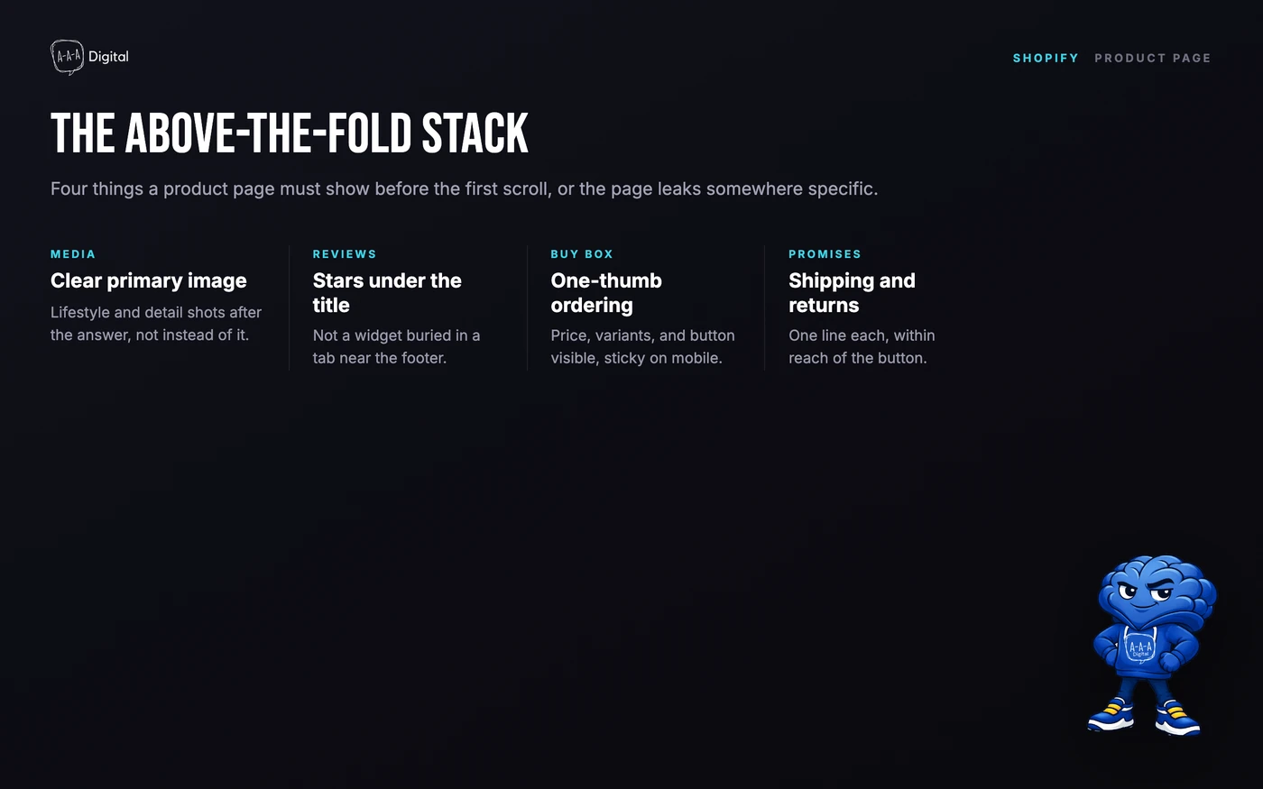
- A media gallery that answers "what is it" in two seconds. What: a clear primary image, then lifestyle, scale, and detail shots, with video where use is not obvious. Why: the first image wins or loses the scroll-past; Baymard's product page benchmarks keep flagging weak imagery. How to check: show the page to someone for five seconds, then ask what the product is and who it is for.
- Reviews beside the title, not in a buried tab. What: star rating under the title plus a full reviews widget. Why: reviews are the highest-impact trust feature on the page, and hiding them destroys their value. How to check: at scroll position zero on mobile, you should see stars without moving. Collect them with post-purchase emails and an app like Judge.me or Loox.
- A buy box that works one-handed. What: price, variant selector, quantity, and buy button visible without scrolling, with a sticky button on mobile. Why: every scroll between decision and button loses a slice of ready buyers. How to check: on a phone, count the taps from landing to "added to cart." Three or more means the layout is fighting you; a Shopify development partner can usually fix this in hours.
- Shipping and returns promises next to the button. What: one line each, such as "free shipping over $50, arrives in 3-5 days, 30-day returns." Why: unanswered questions at the decision point are a conversion tax. How to check: if finding out when it arrives or whether it can be returned requires leaving the page, the feature is missing.
- Urgency used honestly. What: real inventory counts and real delivery cutoffs. Why: fake countdown timers buy a short-term lift and pay for it in trust, returns, and FTC exposure. How to check: if the timer resets when you reload, delete it.
Cart and Checkout Ecommerce Website Features
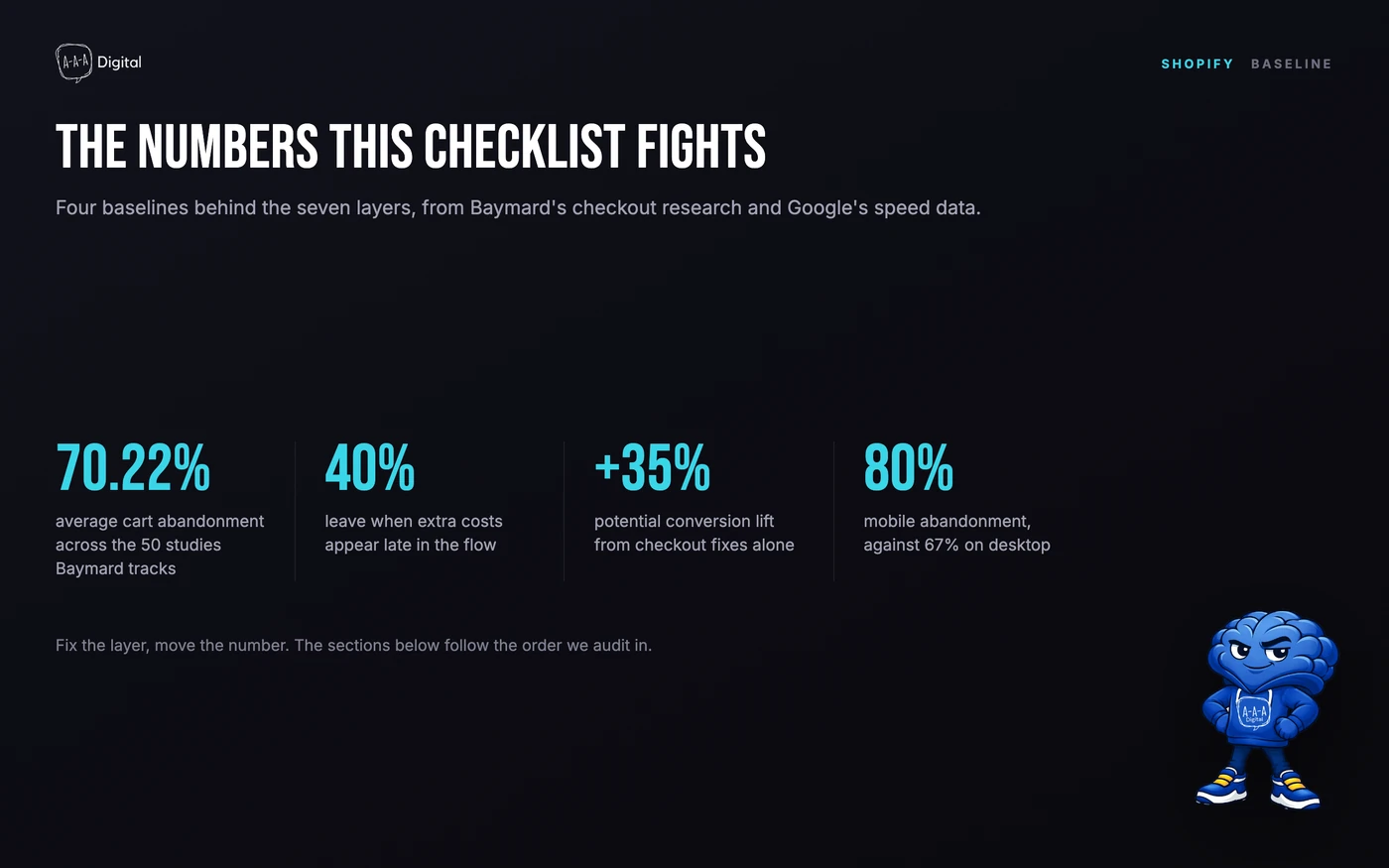
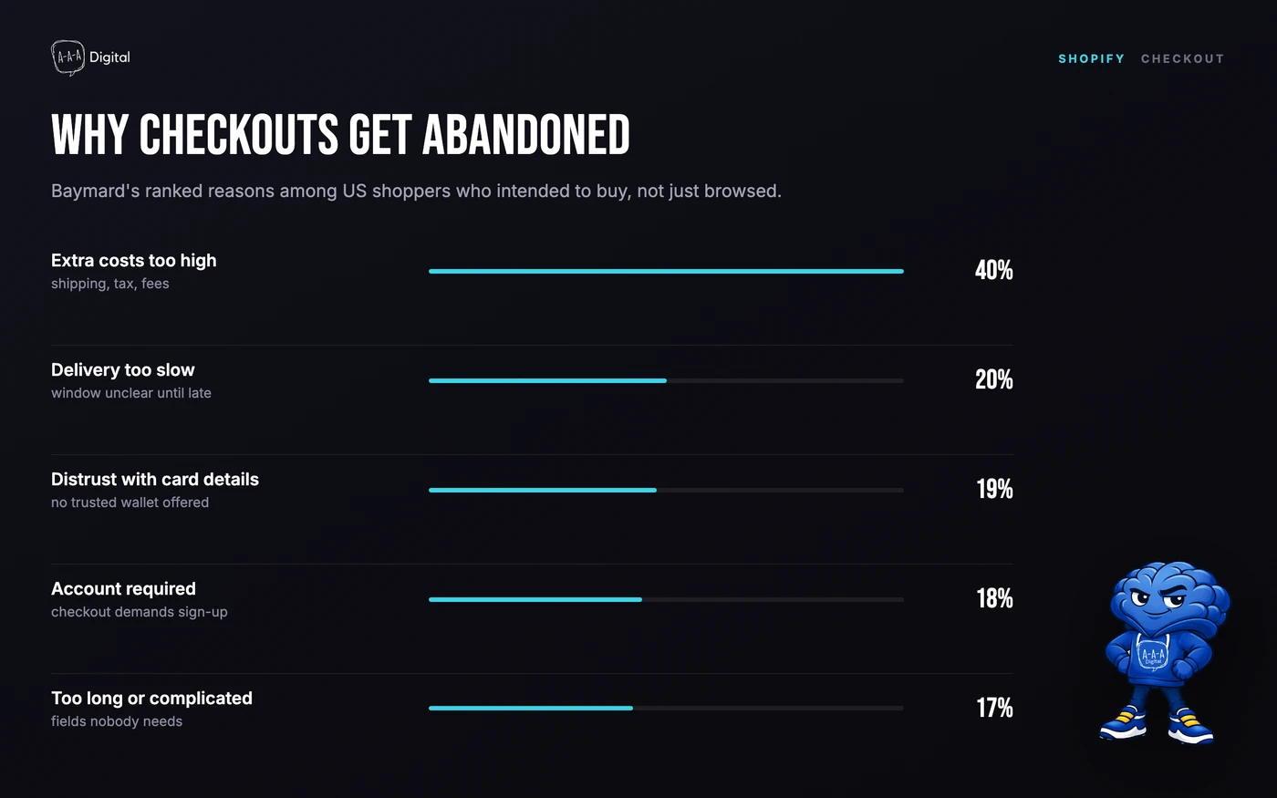
Baymard Institute's meta-analysis of 50 studies puts the average cart abandonment rate at 70.22%, and their survey of US shoppers ranks the reasons: extra costs too high (40%), delivery too slow (20%), distrust with card details (19%), a required account (18%), and a checkout that is too long or complicated (17%). Baymard estimates the average large site could gain up to 35% in conversion from checkout fixes alone. Each reason maps to a feature below.
- A cart drawer instead of a cart page redirect. What: a slide-out cart with a checkout button, recommendations, and a free-shipping progress bar. Why: page redirects break momentum right after the highest-intent click on the store. How to check: add a product and see where you land.
- Every express wallet your market uses. What: Shop Pay, Apple Pay, Google Pay, and PayPal at minimum. Why: wallets remove the moment where 19% of abandoners said they distrusted the site with card details. How to check: confirm all eligible methods are enabled, then place one real test order per wallet each quarter.
- Guest checkout switched on. What: buying without an account, with account creation offered after purchase. Why: 18% of abandoners leave when a site demands an account. How to check: in a private window, buy your cheapest product and count the password prompts. The answer should be zero.
- Address autocomplete. What: type-ahead suggestions in the shipping form. Why: mistyped addresses cause failed deliveries, support tickets, and chargebacks. How to check: start typing your street in checkout; if nothing suggests completions, the feature is off. Shop Pay covers returning buyers automatically.
- Total cost transparency before the last step. What: shipping, tax, and fees visible in the cart, not after payment details are entered. Why: extra costs shown late are the number one documented abandonment reason. How to check: the cart must state the full landed cost before checkout begins.
- A free-shipping threshold set with intent. What: a threshold 15-30% above your average order value, with a visible progress bar. Why: a deliberate threshold lifts AOV; a round number pulled from the air just discounts orders that were already large. How to check: compare your threshold to your AOV today.
The deeper playbook for this layer is our guide to Shopify checkout customization. When a theme will not let you fix the items above, that is a build problem, not a settings one, and it is what our website development team untangles.
Trust Ecommerce Website Features: Returns, Shipping Clarity, Contactability
Trust features are the ones designers delete first and revenue misses most.
- A return policy written for buyers, not lawyers. What: plain-language terms, one page, linked beside the buy button. Why: a returns policy shoppers cannot parse reads as "we make this hard." How to check: can you summarize your own policy in one sentence, in under 30 seconds? If not, rewrite it.
- Shipping clarity wherever hesitation happens. What: delivery windows on product pages, in the cart, and at checkout. Why: slow or unclear delivery is 20% of abandonment. How to check: count the clicks between "I like this" and knowing the arrival date; more than one is a leak.
- Contactability that actually works. What: a visible contact route that gets answered. Why: unanswered pre-sale questions are lost sales; ignored post-sale questions are chargebacks. How to check: send a test email. If it is not answered within one business day, your contact page is decorative.
- Policies where decisions happen. What: returns, privacy, and terms linked near the buy button, not only in the footer. Why: footers are where policies go to hide, and buyers know it. How to check: confirm each policy is one click from a product page.
Retention Infrastructure: Email, Accounts, Order Tracking, Loyalty
Acquisition gets the budget; retention infrastructure gets the revenue. These ecommerce website features decide whether a first order becomes a customer.
- Email capture with a real reason. What: a signup offer that promises something specific, wired to a welcome flow. Why: the email list is the only audience you own, and ad costs only move in one direction. How to check: sign up yourself; a welcome email should arrive within five minutes (Klaviyo or equivalent).
- Customer accounts worth logging into. What: order history, saved addresses, and one-click reorder. Why: accounts make the second purchase nearly frictionless, and repeat buyers convert higher and cheaper. How to check: create an account, place an order, and count the clicks to reorder it.
- Self-serve order tracking. What: a tracking page or link that answers "where is my order" without an email. Why: WISMO is the single most common support ticket in ecommerce; self-serve tracking deletes it. How to check: can a customer find tracking from the confirmation email in one click?
- Loyalty hooks that match your margins. What: points or referrals where repeat purchase is natural. Why: a well-run program raises frequency, but a badly run one trains discount-seeking. How to check: if you run one, is it visible post-purchase? If margins cannot support it, skip it deliberately.
The SEO Layer: Schema, Sitemaps, Canonical Hygiene
The layers above make a visitor convert; this layer decides whether the visitor exists. Most stores we audit stop at the basics, leaving rich results and clean indexation on the table. The full markup playbook is our Shopify structured data guide.
- Product structured data. What: JSON-LD markup carrying price, availability, and reviews so Google can render rich results. Why: rich results earn the click in a crowded results page without a ranking change. How to check: run Google's Rich Results Test on three product URLs; missing offers or review snippets mean partial markup.
- A clean, submitted sitemap. What: an XML sitemap listing canonical pages only, submitted in Search Console. Why: it tells Google what to crawl and what you consider canonical. How to check: load /sitemap.xml, confirm no 404s or redirects inside, and check it reads "Success" in Search Console.
- Canonical hygiene. What: canonical tags that agree with reality, no parameter URLs indexed, no duplicate collection variants. Why: Shopify's multiple-collections and pagination patterns spawn duplicates that split ranking signals. How to check: search site:yourdomain.com for obvious duplicates, and check Search Console's Pages report for "Duplicate, Google chose different canonical."
- Indexation that matches your catalog. What: the count of indexed pages roughly equals the count of pages you want ranked. Why: a big gap means crawl or quality problems are hiding live sales pages. How to check: compare Search Console's indexed count to your real page count every month.
How to Keep This List Green
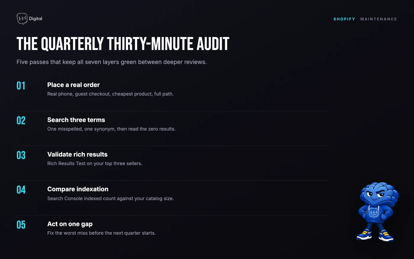
Stores change; features rot. A theme edit quietly deletes a filter, an app update moves a setting. Run this audit quarterly, thirty minutes:
- Place a real order on a real phone, guest checkout.
- Search your store with three customer terms, one misspelled.
- Run the Rich Results Test on your top three sellers.
- Compare Search Console's indexed count to your catalog size.
- Read zero-result searches and act on one.
FAQ
What are the most important ecommerce website features for a new store?
If you can only fix five things, fix mobile speed, a one-handed buy box, guest checkout with express wallets, visible shipping and returns terms, and review stars beside the title. Together they cover the top documented reasons shoppers leave; everything else compounds.
How much does it cost to add missing ecommerce features?
Most items are configuration, not development: enabling wallets, writing policies, turning on filters, and wiring a welcome email are free or near-free. Paid work starts when the theme blocks the fix, ranging from a few hundred dollars for a swatch tweak to five figures for a checkout rebuild. The audit tells you which kind you have before you spend.
Do I need a custom-built store to have all 31 features?
No. A well-configured Shopify theme covers roughly 24 of the 31 out of the box; the gaps are usually configuration misses, not platform limits. Custom development matters when your catalog logic, checkout requirements, or markup needs outgrow theme settings, which is when the total-cost math of a rebuild beats a patch.
How often should I audit my ecommerce website features?
Quarterly for the full list, monthly for indexation and search analytics, and weekly during peak season. Stores drift: apps update, staff edit themes, and payment settings change. The 30-minute quarterly pass is the minimum that keeps the list honest.
Get the Checklist Built In
You can run this list yourself in an afternoon, and most stores should. If you would rather have a team that has run it on 200+ stores tell you exactly which of the 31 your store is failing, that is where we start. Our website development engagements begin with this audit as the scope, so the build is priced against evidence, and nothing ships half-done.
