Fourteen seconds. That is how long a visitor lasted on a jewelry store we audited last spring before the third popup of her session covered the screen. The store had four popup apps installed, each with its own triggers, and between them they fired on arrival, on scroll, on exit, and once more at checkout. Conversion rate had been sliding for two months and the merchant could not work out why. The answer was not the popup design. It was the timing.
I see this pattern constantly as the person who designs these overlays for our retainers. Popup content gets all the attention: the headline, the discount, the spin wheel. But the trigger rules underneath decide whether a popup earns its impression. Get the timing right and a popup is one of the highest-converting elements on a Shopify store. Get it wrong and you are training visitors to close tabs.
Here are 11 popup examples, each one built around a timing rule, plus the mobile interstitial rules from Google that most roundup posts skip entirely.
The Shopify popup numbers nobody agrees on
Before the examples, an honest look at the data, because popup statistics on the internet are a mess. Published benchmarks disagree wildly. Popupsmart's 2025 analysis of more than 10,000 campaigns puts the average popup conversion rate near 3.5%. OptiMonk's dataset averages above 11%. Same tactic, different counting methods, and both are technically true.
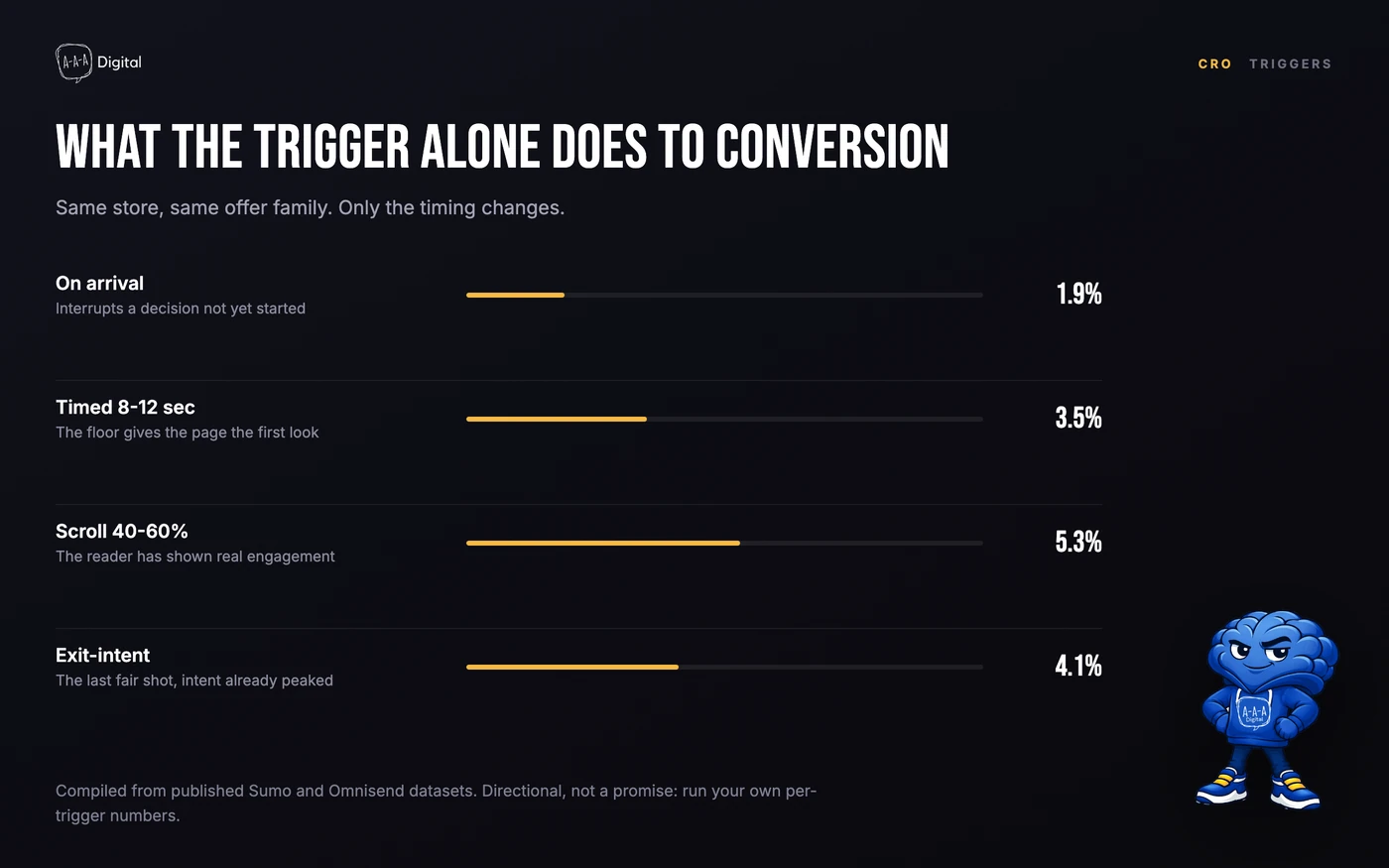
The numbers I trust are the directional ones. Sumo's analysis of roughly 2 billion popups found exit-intent popups converting at about 4.1%, versus 1.9% for popups fired the moment someone arrives. Omnisend's review of 1.24 billion popup displays found that a 6-10 second delay consistently beats an immediate display. The lesson in both: the trigger and the wait matter about as much as the offer does.
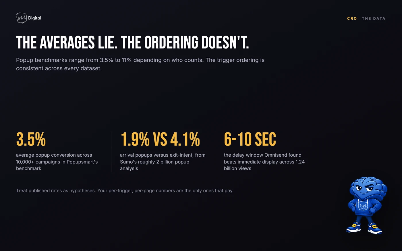
Treat every benchmark as a starting hypothesis, not a target. The only conversion rate that pays your rent is your own, measured per trigger, per page type, per device.
Rule 1: the seconds-on-site floor before any popup fires
If you take one rule from this post, make it this one: no popup before the visitor has had time to actually see the page. The floor I design around is 8 seconds on product and collection pages, 10-15 seconds on content pages where people are reading, and never on the first pageview of a returning customer.
Why a floor at all? Because a popup that fires on arrival interrupts a decision the visitor has not started yet. Sumo's 1.9% arrival-popup number is what interrupting looks like in aggregate. Give the same popup the same offer an 8-second head start and it stops competing with the page for attention.
There is also a silent cost to early popups: they corrupt your analytics. A visitor who bounces within 5 seconds because a modal covered the product photo looks like a content problem in your reports. We have spent days fixing "landing page issues" that turned out to be a popup app with a 3-second trigger.
Shopify popup timing rules at a glance
This is the working table our team plans from. Floors are minimums, not targets; if your data supports longer waits, wait longer.
| Trigger | Floor | Where it works | Where it backfires |
|---|---|---|---|
| Timed welcome | 8-12 sec, first visit only | Homepage, collection pages | Product pages mid-decision |
| Scroll-depth | 40-60% of page | Blog posts, buying guides | Short pages with nothing to scroll |
| Exit-intent (non-cart) | Cursor toward browser chrome | Blog, collection, product | Mobile, where exit-intent barely exists |
| Exit-intent (cart) | Only once cart value is visible | Cart page, cart drawer | Asking for the email before the save |
| Add-to-cart | One beat after confirmation | Product pages near a threshold | Covering the checkout button |
| Post-purchase | Order status page, 2-3 sec in | Thank-you page, returns flow | Any pre-purchase page, ever |
| Mobile banner | 10 sec, bottom strip only | Sitewide | Full-screen interstitials on entry |
Examples 1 to 3: entry and scroll-depth popups
Example 1: a welcome popup that waits its turn
The classic incentive popup, 10% off your first order in exchange for an email, still works when it waits. The version I ship defaults to 10 seconds, first session only, with a 7-day suppression for anyone who closes it. The offer itself matters less than merchants think; our breakdown of Shopify discount code ideas covers the incentive side properly.
One design detail consistently lifts these on mobile: the two-tap version. Name and email on one screen asks a phone user to type 40 characters into a modal. A "Get my 10% off" button that expands the form into a full-page view converts better on every store where we have tested it. And whatever the popup captures should land in a welcome flow within minutes, not a generic newsletter list. Email flows that convert live or die on the speed of this handoff.
Example 2: a scroll-depth popup on content pages
A reader 50% of the way through a buying guide has told you something a homepage visitor has not: they care about this topic. That is the moment a content upgrade popup earns its place. Trigger at 50% scroll and offer the thing the article is actually about, a sizing chart PDF, a checklist, a comparison sheet. Not a generic newsletter pitch.
Scroll depth beats time-on-page as a trigger here because people scroll even when a tab is only half-read. What fails: firing at 25% on a 1,200-word post, which catches readers still deciding whether the article is worth their time.
Example 3: a scroll-depth popup on product pages
Same mechanism, different job. On a product page I use a 60% scroll trigger for a low-friction question rather than an email ask: "Not sure about sizing?" or "Want the care instructions?" Clicking opens a small drawer with the answer, and for shoppers who engage, an optional email capture at the end. The scroll floor protects the decision moment at the top of the page, where the add-to-cart button lives.
Examples 4 and 5: exit-intent popups on cart vs non-cart pages
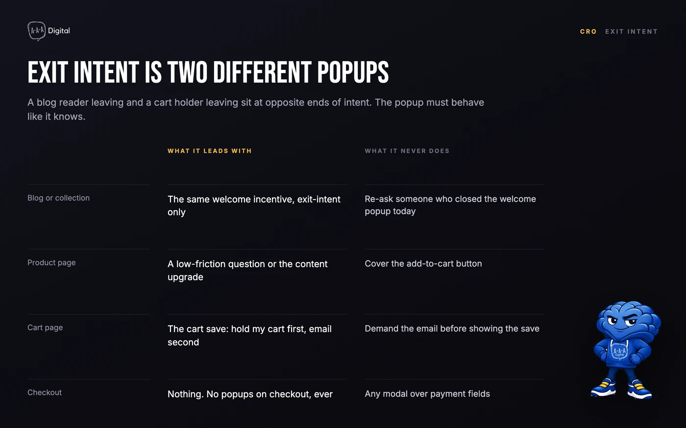
This is the distinction most popup roundups flatten, and it is the one that changes revenue. Exit-intent on a non-cart page and exit-intent on a cart page are two different instruments.
Example 4: exit-intent email capture on non-cart pages
On blog and collection pages, exit-intent is your last fair shot at an email. The design rule: the popup appears only when the cursor moves toward the browser chrome, and the offer matches the welcome popup so the two never compete. Desktop only, honestly. Exit-intent barely exists on touch devices, and every app that claims mobile exit-intent is guessing from scroll velocity.
Example 5: exit-intent on the cart page
Here the rules flip. A shopper leaving a cart page is further along than a shopper leaving a blog post; a cart holds intent, sometimes real money. So the exit-intent popup on a cart page leads with the save, not the email. The sequence that works: "Leaving? We will hold your cart" first, email second, an incentive last and only if margin allows.
This should sound familiar, because cart abandonment on Shopify is the same psychology one step earlier in the funnel. The popup and the recovery flow are a pair: the popup saves what it can in-session, the flow handles the rest. I have watched stores stack a cart-page exit popup on top of a 5-second sitewide popup, then wonder why the second one converts at a quarter of its benchmark. The first popup spent the visitor's patience. Sorting out trigger conflicts across multiple apps is usually the first week of our Shopify CRO service, and it pays for itself before any new design ships.
Examples 6 and 7: cart triggers and the post-purchase thank-you popup
Example 6: the add-to-cart threshold nudge
Trigger: one beat after the add-to-cart confirmation, which means a deliberate 700ms to 1s delay. The job is a threshold nudge, "You are $11 away from free shipping." This is the highest-converting popup type we deploy when a store has a real threshold, because it answers a question the shopper was already doing math on. What fails: upsell modals that cover the cart drawer. If your popup blocks the path to checkout, you are renting revenue from yourself.
Example 7: the post-purchase thank-you popup
The most underused placement in Shopify is the order status page. The sale is done, the pressure is off, and the customer's guard is down. A thank-you popup here can do three jobs, in order of value: ask one survey question, offer a referral, or cross-sell with a same-box framing ("your order ships tomorrow, add this and it goes in the same parcel"). Keep it to one action, and never put a discount here. You would be teaching a brand-new customer to wait for coupons before their second order has even shipped.
Timing discipline matters most on this page because the customer will see it repeatedly while checking tracking. Show the popup on the first two views, then suppress it forever. Nobody needs a referral ask on their fifth tracking check.
Example 8: mobile popups under Google's interstitial rules
Now the rule that protects your rankings. In January 2017 Google rolled out a penalty for intrusive interstitials on mobile: pages that show a popup covering the main content when someone arrives from search can be demoted in rankings, and the signal is still enforced. The stated exceptions are legally required notices (cookie consent, age verification), login dialogs for genuinely non-public content, and banners that use a reasonable amount of screen space.
In practice, for a Shopify store:
- No full-screen email popup on the first mobile pageview from search. Ever.
- If you want a mobile popup, make it a bottom banner covering under a quarter of the screen, delayed at least 10 seconds, dismissible in one tap.
- Keep popups off checkout entirely. Conversion risk aside, a modal over payment fields is the fastest way to lose a mobile sale.
I have replaced more full-screen mobile popups with slim banners than any other single fix, and the pattern is always the same: email capture dips slightly, then bounce rate recovers more than enough to pay for the difference.
Examples 9 to 11: surveys, discipline, and spin-to-win guardrails
Example 9: a popup survey that actually gets answers
The surveys that get answers share a shape: one question, three to five answer buttons, zero typing. "What almost stopped you from ordering today?" with clickable answers beats a multi-field form by an order of magnitude. Trigger it on the order status page after delivery, not on exit from the cart. Post-purchase respondents tell the truth; exiting shoppers just want the modal gone.
Example 10: one popup at a time, with real suppression
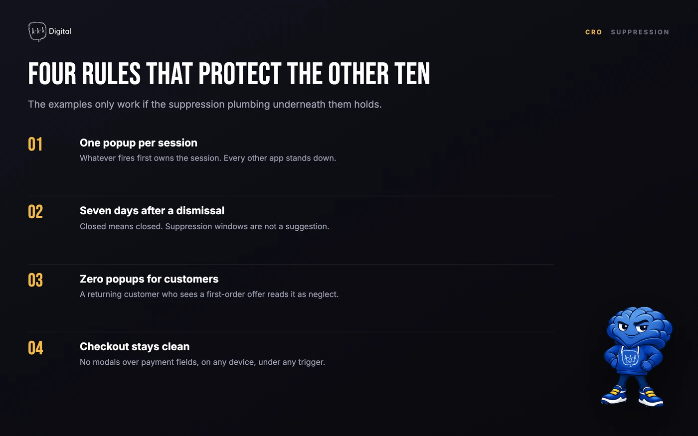
The jewelry store from the top of this post had four apps firing independently, and the fix was not better popups, it was fewer. The discipline: one popup per session, a 7-day minimum suppression after any dismissal, and a hard rule that a visitor who converts sees zero popups for the rest of their customer lifetime. That last rule is the one almost nobody implements, and it is why existing customers end up seeing "10% off your first order" banners. That is not a minor bug. It tells your best customers you are not paying attention.
Example 11: spin-to-win with training wheels
Gamified wheels convert, and the same mechanics that make them convert make them irritating. If you run one, fire it on exit-intent or after the 8-second floor, never on arrival; cap spins at one per session; and keep the segments honest, because a wheel where every field pays out 15% off trains the same coupon-waiting behavior as premature discounts. Test the wheel against a plain offer popup before believing the app's dashboard. Proper Shopify A/B testing will tell you fast whether the wheel is adding subscribers or just adding spin.
The four suppression rules behind every example
The 11 examples only work if the plumbing underneath them holds. When I audit a store, the first thing I check is not any single popup, it is the suppression settings across every app, because that is where timing discipline actually lives.
FAQ
How long should I wait before showing a popup on Shopify?
At minimum 8 seconds on product and collection pages, and 10-15 seconds on content pages. Immediate popups are the worst-performing trigger in the published data, converting at roughly half the rate of timed ones. If you only change one setting this week, change the delay.
Do popups hurt my Google rankings?
Full-screen popups on the first mobile pageview from search can, yes. Google has penalized intrusive mobile interstitials since January 2017. Banners that use a small, reasonable share of the screen, delayed well after arrival, are the safe pattern for email capture.
How many popups should a Shopify store run at once?
One active popup per session, whatever fires first. Stores running three or four popup apps with independent triggers see the later popups convert at a fraction of their benchmark because the first ones spend the visitor's patience. Consolidate triggers, not just apps.
What is a good popup conversion rate?
Published benchmarks range from about 3.5% to 11% depending on the dataset, with well-timed exit-intent and scroll popups at the higher end. Rather than chasing an average, measure each trigger on your own store and fix the worst-performing one first.
Get Help With This
Popups are small pieces of design with outsized effects on conversion, email growth, and even rankings, which is exactly why timing deserves more attention than the headline does. If your store is running more than one popup app, or your popups fire before visitors have seen the page, our Shopify CRO team can untangle the triggers and rebuild them around the rules above.
