A good Shopify website is not a template with your logo pasted on top. It is a short list of decisions made in a specific order: what the first screen sells, what the product page proves, and what the logistics block promises before the buy button. The eight stores below each solve one of those decisions better than almost anyone, and every lesson here transfers to a store with a fraction of their budget.
What separates a good Shopify website from a template
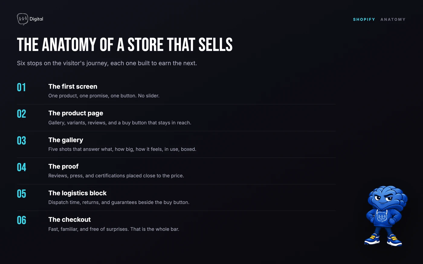
A template gives you sections. A store gives you decisions. After rebuilding enough Shopify storefronts, we can tell in ten seconds which one a merchant made, because the same six decisions show up every time a store stops looking templated.
1. The first screen has one job. A first-time visitor should know what you sell, who it is for, and why it beats the alternative in under three seconds. And most templates default to a full-bleed hero with a slogan that means nothing. Swap the slogan for a product, a price anchor, or a concrete promise and the same theme suddenly looks designed. If paid traffic is part of your plan, this is where dedicated ecommerce landing pages earn their keep: one screen, one offer, one button.
2. The product page is the real homepage. Strangers rarely meet your homepage. Paid ads land on products. Organic search lands on products. Social traffic lands on products. The homepage is for people who already know you; the product page is where everyone else decides. That is where the design budget goes: gallery order, variant picker, reviews near the title, a shipping promise beside the buy button. We wrote the full playbook in our product page conversion fixes, and the first rule is simple. Treat the product template as the most expensive real estate on the site.
3. Photography is the copy. On a template, photos fill slots. On a good store, photos do the selling. The system we ask every client for: one clean hero on a consistent background, one scale reference, one texture close-up, one shot in use, one of the packaging. Same light, same crop, same background across every SKU. Shoppers read photos faster than headlines, and a store with forty products and one photography system looks bigger than a store with four hundred and none.
4. Typography carries what photos cannot. Two families. Three weights. One display size you use loud and often. The theme default at 16px is why most stores feel generic, and type is the cheapest place to look intentional. Bold type is a decision, and it commits the whole page. I have redrawn this layout more times than I will admit, and the type decision is the one that makes it feel designed.
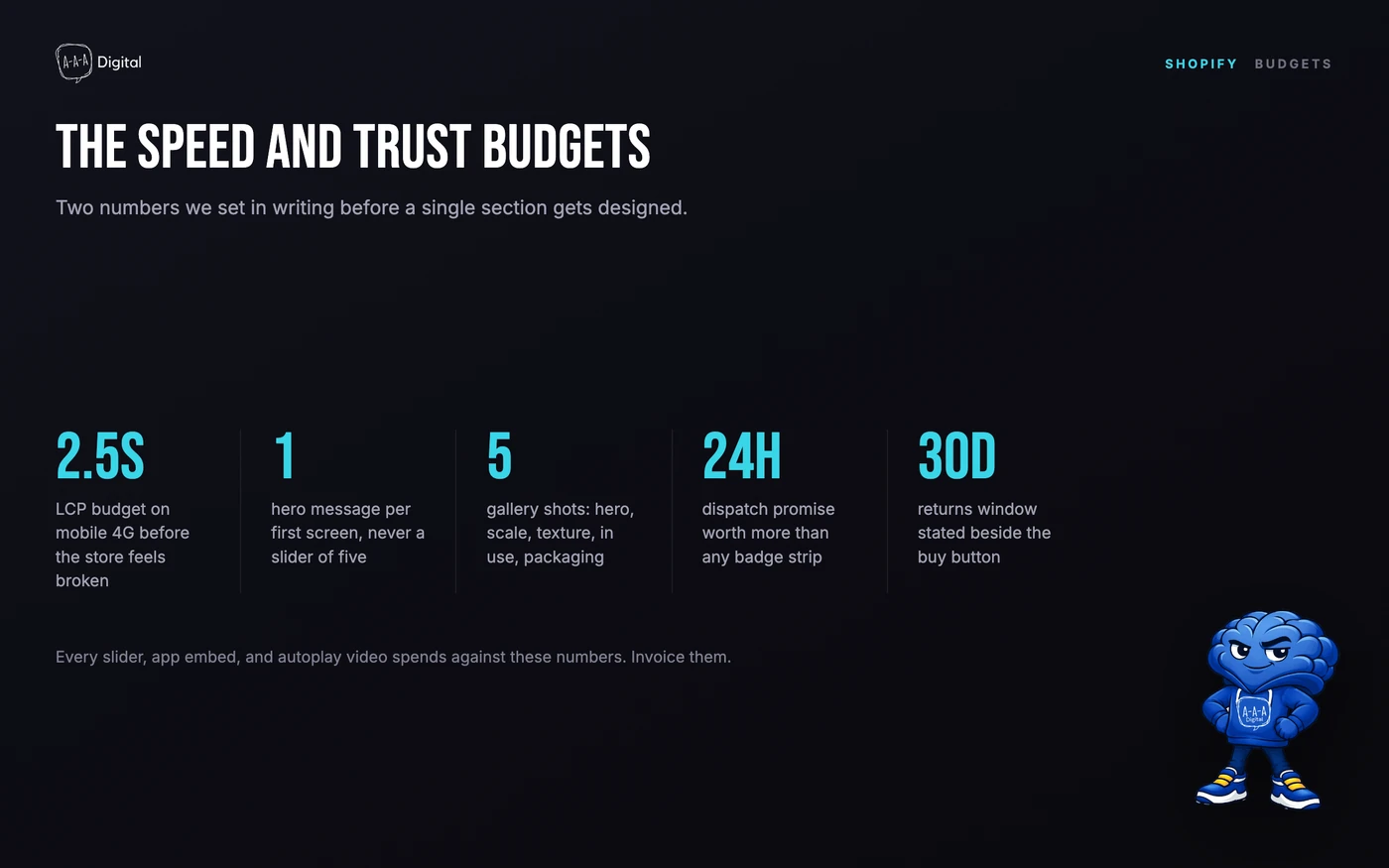
5. Speed is a budget, not a feature. Pick a number before you design anything: largest contentful paint under 2.5 seconds on a mid-range phone over 4G. Then treat every slider, autoplay video, review widget, and app embed as spend against that number. Sliders are where speed and attention both go to die. We cut them first on nearly every rebuild. A fast store that looks plain outsells a beautiful one that takes five seconds to load.
6. Trust is built from logistics facts. A badge strip says trust us. A logistics block says ships within 24 hours, free returns for 30 days, 4.8 stars from 12,000 reviews. Specific claims next to the buy button beat any badge in the footer, and this is also honest marketing: state the promise you can actually keep, then keep it.
The eight stores at a glance
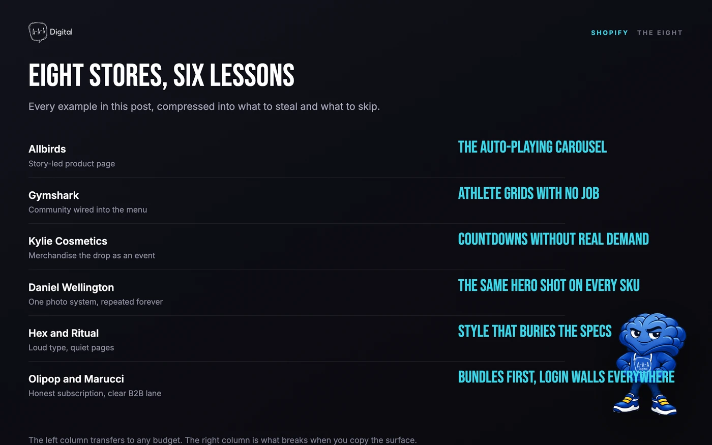
Here is the whole post as a table. The nuance, and the caveats, are below it.
| Store | What to steal | What to avoid copying |
|---|---|---|
| Allbirds | Product storytelling that treats materials as the hero | The auto-playing homepage carousel |
| Gymshark | Community wired straight into the navigation | Athlete grids that lead nowhere |
| Kylie Cosmetics | Drop model merchandising, countdown and all | Hype mechanics without the audience |
| Daniel Wellington | A photography system that repeats on purpose | The same hero shot on every SKU |
| Hex | One bold type decision, held everywhere | Display type that buries the specs |
| Ritual | A quiet product page that lets proof speak | Pages so calm they hide the buy button |
| Olipop | Subscription UX that explains itself in one line | Bundles pushed before the first order |
| Marucci Sports | A B2B lane with quick order and clear terms | Login walls where a retail price belongs |
How to study a store without copying it
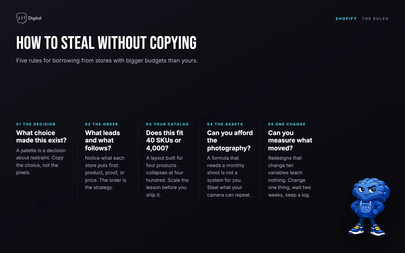
Every store below runs a budget you cannot match, so steal the decision behind each element, not the decoration. A color palette is a decision about restraint. A navigation label is a decision about how customers think. The examples only work if you translate them into your catalog, your photography, and your traffic sources.
The eight examples
1. Allbirds: product storytelling
What they do. The product page treats material innovation as the plot. What the shoe is made of, why that matters, and what it feels like on your foot, in that order. Sustainability claims ride along as facts, not lectures.
The one thing to copy. Structure your product copy as a story with a fixed order: what it is, what it is made of, why you will feel the difference. Specs come last, for the detail-oriented.
The one thing to avoid. The rotating homepage carousel. Theirs is polished because their brand carries the first slide; yours will be three slides nobody watches. One strong static hero converts better. We borrow this trick constantly.
2. Gymshark: community and navigation
What they do. The menu is built around how their community shops: by product, by collection, by activity. Training content, athletes, and social proof sit one click from the catalog instead of buried in a blog graveyard.
The one thing to copy. Name navigation entries after how customers actually shop, by use case and collection, not after your internal category names. Your navigation is a mirror of your customer's vocabulary.
The one thing to avoid. The athlete grid without the community. A wall of influencer photos with no engagement behind them reads as advertising, not belonging. Community is the asset; the grid is just its shadow.
3. Kylie Cosmetics: drop model merchandising
What they do. Collections are built like drops. Limited runs, countdown timers, sold-out states used as proof of demand. Scarcity is structural, not a plugin, because the catalog is genuinely limited while a drop is live. The checkout is treated as part of the show, and if you run drops, Shopify checkout customization is where the experience holds or breaks.
The one thing to copy. When inventory is genuinely limited, merchandise it like an event: one collection page, one countdown, one clear end state. Urgency that maps to reality converts; urgency that maps to nothing trains customers to wait.
The one thing to avoid. Fake scarcity. A countdown timer on a permanent catalog teaches customers to distrust every price on the site. Nothing burns a brand faster than a sold-out badge that restocks every week.
4. Daniel Wellington: the photography system
What they do. For years, one photography formula: minimal watch, clean wrist, soft light, muted background. The product changes; the frame never does. That repetition is the brand, and it is the clearest case that a photography system beats photography talent. The wider lesson about a promise repeated until it sticks is the one we covered in building a brand that sells.
The one thing to copy. Define your five shots and never improvise. A formula applied across hundreds of SKUs is what reads as a brand, not a catalog.
The one thing to avoid. Copying the minimalism without the discipline. One formula applied inconsistently looks like a clearance rack, and no amount of soft light saves it.
5. Hex: bold type
What they do. Display type used loud, on every template, with photography playing support instead of lead. The grid is tight, the type is enormous, and the whole store commits to the decision.
The one thing to copy. Pick one loud type decision and hold it across every template. Loud, confident type makes a small catalog look like a fashion label and costs almost nothing to implement.
The one thing to avoid. Display type over information. If specs, sizing, and shipping details get typographic styling instead of clarity, the boldness starts costing you sales.
6. Ritual: the quiet product page
What they do. The wellness brand's product pages are calm: ingredient lists with sources, simple claims, soft color, one clear subscription option. The restraint is the positioning. Proof does the selling, through transparent sourcing, certifications, and quietly placed reviews.
The one thing to copy. Let the product page whisper when the category shouts. In wellness, calm reads as confidence and loud reads as desperation. One ingredient table with sources outperforms three paragraphs of superlatives.
The one thing to avoid. Calm that hides the mechanism. A quiet page still needs a visible buy button, a clear price, and one obvious next step. Serenity is not an excuse for a buried add-to-cart.
7. Olipop: subscription UX
What they do. The subscribe option is presented as the smart default, not a trap. One line on what you save, one line on how it works, and skip or cancel anytime stated up front. The flavor page sells the first can; the subscription card sells the routine.
The one thing to copy. State the subscription's terms in one plain sentence where the option appears, including how to cancel. Honesty converts better than a pre-checked box, and it keeps chargebacks and support tickets down.
The one thing to avoid. Pushing the bundle before the first order. A customer who has not tasted the product does not want twelve of them. Earn the subscription after the first delivery, not before it.
8. Marucci Sports: the B2B example
What they do. The sports equipment brand runs wholesale on Shopify alongside retail: quick-order forms, case quantities, price lists behind a login for qualified buyers, and a shared catalog so inventory tells the truth in both places.
The one thing to copy. If you sell to businesses, give them a B2B lane: quantity entry on the collection grid, clear tiered pricing, and reordering in three clicks. Businesses buy again when reordering is boring.
The one thing to avoid. Login walls where they do not belong. Hide wholesale prices, not retail ones. Every extra wall between a retail visitor and a price costs you a sale you already paid to attract.
FAQ
What makes a Shopify website look professional instead of templated?
Decisions. One hero message instead of a slider. A photography system instead of mixed shots. Type set with intent. Logistics facts beside the buy button. A template looks templated when every section is left at its default, and professional the moment someone chooses.
Should I copy a big brand's Shopify store design?
Copy the decision behind each element, not the element. Allbirds can carry a homepage carousel because their brand fills the first slide; you cannot yet. Match each lesson to your catalog size, your traffic sources, and your photography budget before you touch a theme setting.
Which Shopify theme do these stores use?
Most large stores run heavily customized themes, and plenty are custom builds, so "what theme is that" is usually the wrong question. Start with a fast base theme and make the six decisions above. If you want the short list our design team keeps coming back to, read the nine themes we actually recommend.
How much does it cost to build a Shopify store like these examples?
The theme and apps are the small part. A disciplined build on a premium theme runs a few thousand dollars; custom design runs five figures. The expensive part of every store above is not the build, it is the photography, the content, and the years of iteration behind the polish.
How do I know if my Shopify website is slow?
Test the product page, not the homepage, in PageSpeed Insights with mobile selected. If largest contentful paint passes 2.5 seconds on a mid-range phone connection, start cutting: sliders first, then apps you cannot tie to revenue.
The short version
Study stores the way you would study a competitor's ad account: take the strategy, leave the spend. The eight stores above earned their look through decisions you can copy for free, and the order of those decisions matters more than any single one. If you want a store built with these decisions made in the right order, our Shopify development service starts with the six decisions above, not with a mood board. And if the template question is still open, the best Shopify themes we recommend are the short list we start from.
